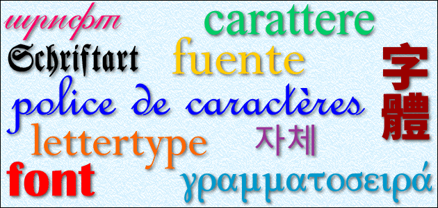
What do the words font and police have in common?
Well, a font or typeface as used in computers and other electronic devices is called a police [pɔ.lis] or police de caractères in French.
As well as meaning font, police also means policy, branch or department. It comes from the Italian word polizza (policy, bill, voucher), from the Medieval Latin apodissa (receipt for money), from the Byzantine Greek *ἀπόδειξα (*apódeixa), from Ancient Greek ἀπόδειξις (apódeixis – proof, publication, demonstration). The English word policy comes from the same root [source].
The word police, as in the forces of law enforcement, comes from the Middle French police (governance; management), from Latin polītīa (state, government), from Ancient Greek πολιτεία (politeía – citizenship, government, adminstration), from πολῑ́της (polī́tēs – citizen) [source].
Another French word for font, and also melting, smelting, thawing and
cast iron, is fonte [fɔ̃t]. This probably comes from fondre (to melt (down), smelt, dwindle), from the Old French fondre, from the Latin fundere (to melt), from fundō (I melt), from the Proto-Italic *hundō (pour out), from the Proto-Indo-European *ǵʰewd- (to pour) [source].
The word font, as in “a receptacle in a church for holy water, especially one used in baptism”, comes from the Latin fōns/fontis (fountain), possibly from the Proto-Indo-European *dʰenh₂- (to flow) [source]. The name of the River Danube comes from the same root, via the Latin Dānubius, from the Proto-Celtic *Dānowyos, from *Dānu, from the Proto-Indo-European *déh₂nu (river goddess) [source].

What are your favourite fonts?
Garamond. Hands down favorite.
OCR A, Play, uni 05_53, Fixedsys Excelsior
When I am writing ordinary documents, hands down my favorite is Calibri. It is attractive, very readable and as a sans serif font, it doesn’t “get in the way” by being too ornate.
When I am doing extensive Unicode work involving the placement of accents (perhaps in non-standard ways) there is nothing better than Gentium Plus (or sometimes, Gentium Plus Compact).
If I want a LOT of math symbols and special punctuation, plus good overall overage, it’s hard to beat Dejavu Sans and the other Dejavu fonts.
Finally, if I want a broad range of character support that has excellent coverage of both Latin and Cyrillic (even archaic letters), a real nice choice is Roman Cyrillic Std.
I forgot to add: Eurostile and Microgramma
There are so many beautiful fonts out there that it’s hard to pick. In broad terms I’m definitely an enthusiast of the “Old Style”, humanist-based typefaces such as Aldus, Bembo or Palatino, as well as some of the elegant sans-serif varieties developed out of them, like Optima or Candara.
I thought the Font Police would be a group of OCD people ticketing those businesses that reverse A, V, M, W, etc in their signs…..for example….the A……those using Times Serif, the leg on the left is narrow, and on the right, wide. Those reversing it are in violation of Font-law, and should be flogged.
Ha ha! The Font Police – a new series coming to a streaming service near you soon – they ensure that fonts are used appropriately and enforce typographical conventions.