Last Saturday I went to a study day about the Isle of Man put on by the Centre for North-West Regional Studies at Lancaster University. One of the talks was about the Manx language and used quotes from my dissertation – it was great to be recognised like that, and the speaker was quite surprised when I introduced myself to him afterwards.
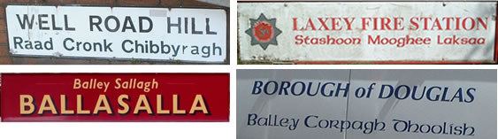
As well as touching on the decline and revival of the language, he also looked at the linguistic landscape of Manx – i.e. the ways Manx is appears on signs and on printed material. What he demonstrated was that Manx translations are often smaller than the English ones, and/or in a different font. The most common fonts are in the Irish uncial style, or An Cló Gaelach. This gives the impression that Manx is less important than English, he suggested.
Here are some examples:
There are more examples on Flickr.
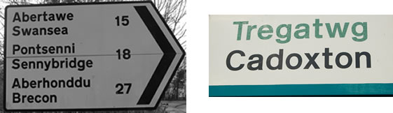
He compared the Manx signs with bilingual signs in Wales, on which both languages are usually the same size and font, and with the Welsh usually first.
He also mentioned that in Quebec the French is usually twice as big as the English, or other language, on signs.
If you live in an area where there are bilingual or multilingual signs, what is the linguistic landscape like?
Actually, in Quebec, it’s law that the French on signs must be at least twice as large as any English, and this was a grudgingly passed law in the 1990’s, after people protested and the United Nations Human Rights Committee declared the former law broke an international covenant on civil and political rights. The former law was that all signs be in French only. This was not acceptable in a bilingual country. Now in southern Ontario, signs are in English first and French second, (same size font) until you get closer to the Quebec border when that switches to French first. I don’t know if that’s the case in Northern Ontario, but I assume, since there is a large francophone population that signs are in French first. The language laws in Quebec and the rest of Canada are a touchy subject.
In the part of Mid Wales where I live, where English is very much the Dominant language, the English almost always comes before the Welsh – but, as in the photos above, generally in the same font and size.
The Irish uncial font may be (or may not be – I don’t know) the way Manx was written before its demise, but its use on road signs etc. portrays the Manx language as quaint and archaic, rather than current and practical – which it has to be to undergo a sucessful revival.
David, the Irish uncial font was not used in Manx texts in the past, as far as I know. These days it is used mainly on signs, posters, promotional material, etc.
That was one of the points the speaker made – using the uncial font gives the impression that the Manx is just there for decoration and shouldn’t be taken seriously.
On street name signs in Ireland the Irish versions of the names are often written in an uncial font, though on road signs the Irish is usually in the same font as the English.
The additional ‘chocolate-box’ signage on Manx road signs does look a bit quaint and added more for a selling-point for the sake of tourism than promotion of the Manx language? But you might argue that it’s better that none at all, I suppose?
In Liverpool the Chinatown area of the city has the street names translated and added in red in Chinese underneath the English
You can see an example of NELSON ST. here:
http://www.liverpoolpicturebook.com/2012/08/LiverpoolChinatown.html
and BERRY ST:
http://www.picable.com/Art/Graffiti/Liverpool-China-Town-Street-Names-1-Berry-Street.2788101
There are sometimes signs or official notices in both English and Spanish here in the Portland, Oregon area, and I remember seeing them in the SF Bay Area where I used to live as well. In all the examples that spring to mind, English comes first, but the Spanish text is rendered in the same font and size as the English.
My daughter’s certificate of New Zealand citizenship/Te Tohu Kiriraraunga is printed in both English and Māori, both languages in equal size and identical fonts. The same is true of our passports/uruwhenua. When we were last in NZ, I noticed the signs on the toilets at Wellington zoo were also bilingual with both languages in equally sized, identical fonts – Men/Tāne and Women/Wāhine. However, in most contexts I see (bearing in mind I live in China and am not often back in NZ), such as names and logos of universities or government departments, the Māori text is usually tiny and very much resembles an afterthought – oh, wait, we better recognise the indigenous language now that it has official status (since 1987).
Here are some similar Chinatown signs from San Francisco. I remember a trip to the SF Chinatown as a child– going to a part of it where the street signs were practically the only text visible in English. It felt very disorienting.
Another example, which I saw today: The local transit authority has a sign posted in all the light-rail trains explaining its non-discrimination policy. It’s in six languages (English, Spanish, Vietnamese, Russian, Korean, Mandarin), all given the same size text and (where applicable) font.
I mean the local transity authority here in the Portland area, that is.
The amount of Manx visible in the landscape here is remarkable and reflects the hard work of language activists over the last 20 years. There is no legal requirement for people to use the language here so visible signage is down too good will of authorities and organisations. I understand it might occasionally look quaint but there are many instances when it doesn’t and is given prominence. Manx is much more visible in my opinion than Gaidhlig is in all but a few areas of Scotland. It must also be remembered that Manx has gone through a successful revival here (even if we do have a few quaint road signs!)
An example of new signage from today is available here;
http://www.manx.net/tv/mt-tv/watch/7394/manx-school-signs
Here in Finland official signage (i.e. road signs, street names, public transport signs and stuff like that) generally have both languages in the same font and size. The majority language of the municipality is always first.
Like this (Finnish+Swedish): http://cache.virtualtourist.com/4/4098251-Street_sign_in_Porvoo_Finland.jpg
or this (Finnish+Northern Sámi): http://www.flickr.com/photos/ralf_herrmann/2302551552/
Sometimes the Finnish text is bold and the Swedish text is “regular”. This is not to emphasize Finnish but simply to make it easier to quickly spot which language is which.
Like this: http://www.flickr.com/photos/sohvimus/5369491825/
However for other things I think there is growing tendency towards having the Finnish text in a large font and having the Swedish (and often English) text in a smaller font. Though I can’t seem to find any proof of this using google’s picture search so maybe the problem isn’t as big as I thought.
A few additions to points made above: In Wales, Welsh and English are in the same font and same size, but whichever comes first depends on where you are, as David Eger notes above. One can see the ‘switcharound’ heading west on the A55 in north Wales (around Colwyn Bay, IIRC) and the M4 in the south (west of Swansea). The same is true elsewhere, though this isn’t always consistent.
http://en.wikipedia.org/wiki/Welsh_road_signs_in_Wales
In Highland parts of Scotland, the situation is a bit more variable. In the core Gàidhealtachd areas, such as Lewis, the Gaelic name comes first, and the English equivalent underneath, in the same font (Transport), but in much smaller letters (earlier, signs were often monolingual Gaelic). More recently, there has been a programme of bilingual signage in mainland areas, and the decision was taken to make the names in each language of equal size; but in contrast to Wales, they would be differentiated by colour.
http://en.wikipedia.org/wiki/Gaelic_road_signs_in_Scotland
In Ireland (outside Northern Ireland, of course), only very old road signs use a variety of Cló Gaelach font or uncial. Signs from the mid-20th century generally use a roman font. All standard signs since the late 80s use a modified version of the ‘Transport’ font used in the UK. As Simon notes, street signs are different, and often use a more ornate font for the Irish language name (cló gaelach noticable on older street signs in Dublin, Cork, for example). In Ireland you are far more likely to get an ‘unofficial’ sign for a tourist attraction added to a signpost, and there often the design is more varied.
On road signs, the Irish-language name is always first (in accordance with the national constitution), but it is in italics, and therefore (in the opinion of some people) the names look less prominent than the English-language equivalents, which are not in italics and are almost always in capitals. The Irish-language italics also have a couple of modified letters (most notably capital A). In Gaeltacht areas, generally only the Irish version of a name is given. The use of italics and capitals makes the signs look more different from the UK than might otherwise be expected, given that the same colour scheme and design principles are used.
http://en.wikipedia.org/wiki/Road_signs_in_the_Republic_of_Ireland
As a final note, you may have noticed that Manx vehicle registration plates use a design borrowed from Ireland. Irish plates have the registration county written above the registration number in Irish, in an uncial font. This feature was added to the design due to campaigning from Irish language activists in the late 80s.
David, I was a little surprised to read that “In the part of Mid Wales where I live, where English is very much the Dominant language, the English almost always comes before the Welsh”, since the vast majority of bilingual signs to be seen in Wales are those erected by the local authorities, and in mid-Wales that means Powys — which covers a quarter of Wales geographically, and always puts Welsh first. See this example from Llandrindod (about as mid- — and non-Welsh-speaking — as you can get in mid-Wales!)
http://www.flickr.com/photos/risgaard/142942534/
One bilingual sign that always has the Welsh first — even in counties in the NE and SE which otherwise put the English first — is the “Ildiwch / Give Way” sign, since that is the only way the words can be laid out without having to make them too small:
http://i.pbase.com/o6/92/829892/1/92951764.65m7v5LX.Givewaysign.jpg
Although private companies are not (yet) obliged to provide bilingual signage, most large stores do, and even in the part of south Wales where I live (in an area where Welsh is still a living language but by no means dominant) the Welsh used on internal signage in Co-op stores, for example, is always at least twice as big as the English underneath …and I notice that Tesco is now starting to follow suit.
Sorry: that “Ildiwch / Give Way” picture appears not to work. Try this one:
http://farm7.static.flickr.com/6032/6239852535_b9043df0bf.jpg